Time series data sits at the heart of most business presentations. Whether the data is annual, quarterly, monthly, or daily, business development and marketing professionals are routinely asked to turn it into visualizations that not only inform, but provide direction to management.
Working with time series data is harder than it looks. Even before you reach the chart, the data itself can fight you—years, months, and quarters often live in separate columns and need to be assembled into a proper date. And once you have correctly formatted dates, a new question appears: how much of each date does the reader actually need to see?
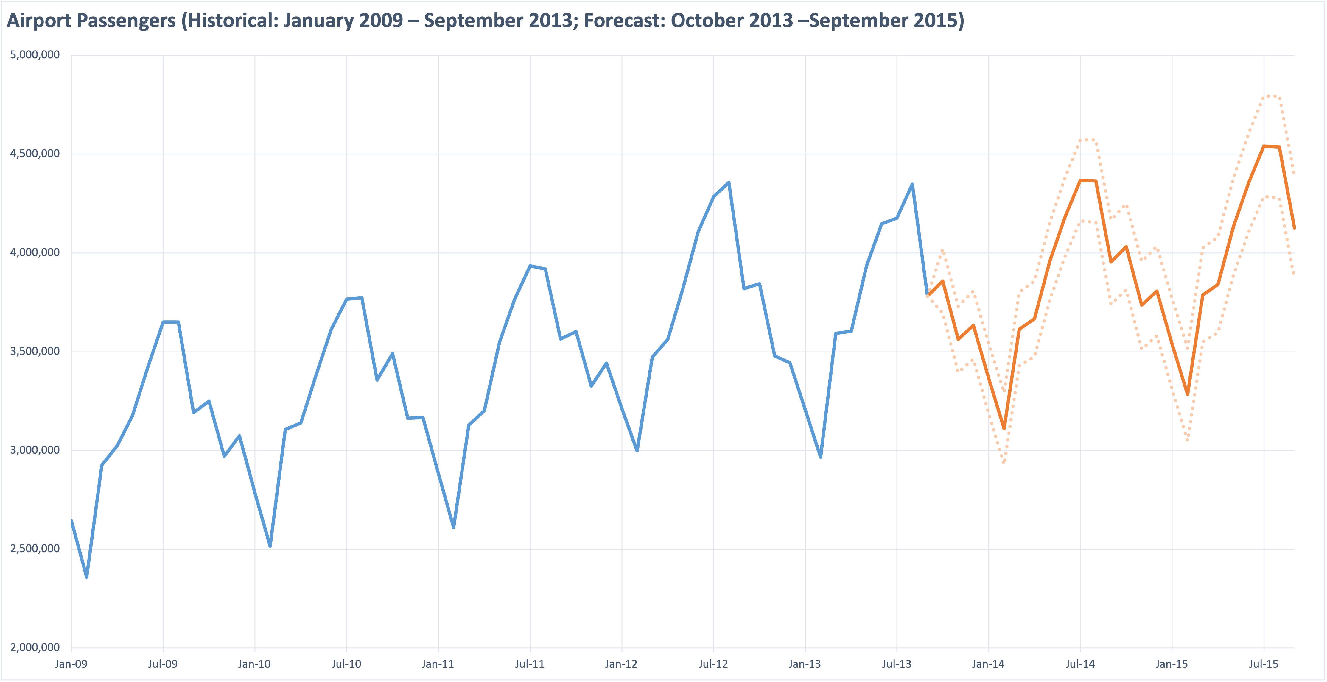
Consider the following chart, which shows monthly data over a six-and-a-half year period.
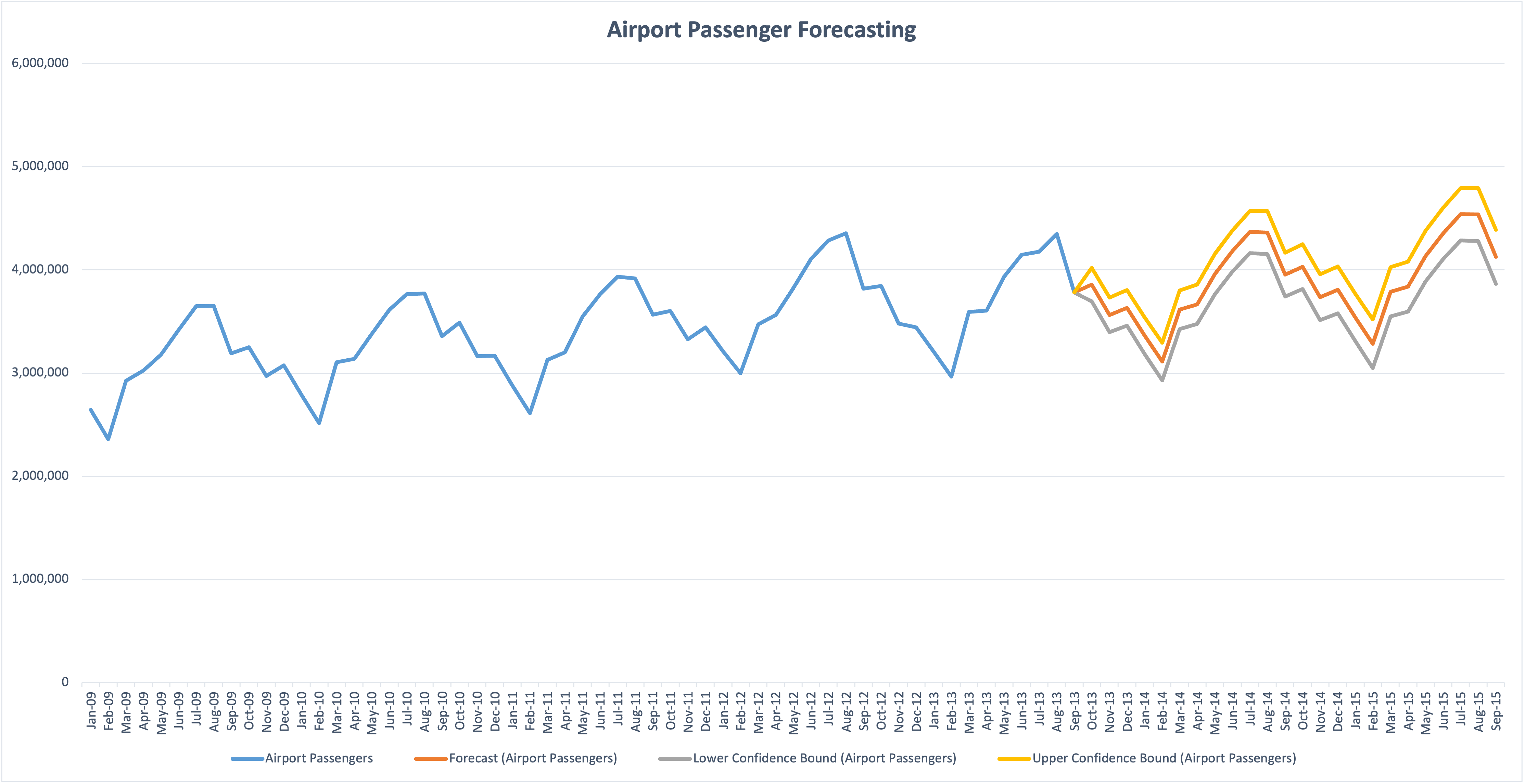

The instinct to show every date because it exists in the data produces two consequences that hurt comprehension: rotated labels that are hard to read, and a cluttered x-axis that slows the eye as it tries to track values over time. The result is visual noise that obscures the story the chart should be telling. People tend to dump their data into charts without thinking visually first.
Excel’s default labeling patterns reinforce the problem—they look rigid, and most users don’t realize they can intelligently control which dates appear or use strategic spacing to produce a cleaner visualization.
A few principles for time series charts
Before walking through the alternatives, here are the guidelines I want each chart to satisfy:
- The x-axis should display only as many dates as the reader needs to anchor the trend.
- Labels should be horizontal whenever possible.
- The y-axis range should reveal variation in the data, not enforce a zero baseline by default.
- The title should do analytical work—telling the reader what to take away, not just what the chart contains.
- Legends should be minimized; encode information in the title or directly on the chart when possible.
Quick improvements in Excel
With tools like Plotnine and ggplot2 readily available in Python and R, I seldom build visualizations in Excel anymore. But a few formatting changes can meaningfully improve the reader’s experience without leaving the application most business professionals are already using.

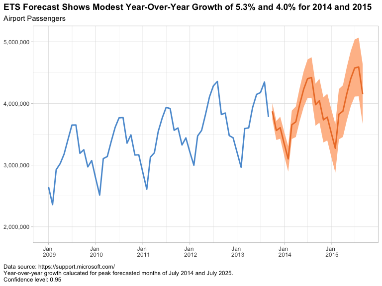
The changes from the original:
- X-axis interval set to 6 months. This eliminates the dense text from the previous chart and, as a bonus, naturally captures the seasonality of the data (lows in February, highs in July or August).
- Vertical gridlines added at those same six-month intervals to guide the eye between key dates.
- Y-axis range narrowed. Because this is a line chart rather than a bar chart, there is no need to start at zero. Choosing a range that captures the actual data accentuates the seasonal pattern.
- Title doing double duty as a y-axis label, with enough information that the legend becomes unnecessary.
- Simpler color palette. Two colors instead of four, with the confidence bounds shown as transparent dashed lines. If the main message were the uncertainty of the forecast, those elements would be emphasized; here, the message is the modest growth of the forecasted values.
A Grammar of Graphics alternative
This example was developed using ggplot2 and the fpp3 R package bundle, but it could just as easily have been built in Python using Plotnine and either statsmodels or statsforecast for the modeling.

In this version I kept several of the default values—the annual x-axis labels, the default font sizes, and the shaded confidence intervals. If I were preparing this for a live presentation, I would adjust the fonts to ensure legibility for the audience.
The first task is making sure dates are handled as a proper time series. When reading the Excel file, the date column is correctly identified as the POSIXct datetime class; however, for time series analysis we want a structure where the intervals are guaranteed to be equal. In R, that means converting the data frame to a tsibble using the yearmonth() function. (Python’s pandas library took a different approach. Wes McKinney designed it from the start around labeled-axis data structures with integrated time series functionality, which is part of why it became the default tool for this kind of work.)
For both ggplot2 and Plotnine, we have complete control over major and minor breaks and gridlines on each axis. That control lets us choose a natural six-month or annual interval along the x-axis that guides the eye along the seasonal trend without introducing clutter.
In grammar of graphics tools, the title is built into the syntax rather than added as an afterthought. That makes it natural to write a title that conveys the message I want the audience to remember: modest year-over-year growth of 5.3% and 4.0% for 2014 and 2015, measured at the July peaks. The chart’s job is to support that claim; the title states it directly.
One additional technique worth exploring on charts like this is the use of alternating shaded bands—quarterly, yearly, or monthly depending on the data—to provide visual anchors and rhythm without adding more gridlines or labels. I didn’t apply it here, but for longer time series it can give the eye natural resting points that further reduce cognitive load.
My Conclusion
Time series charts go wrong when defaults take over: every date displayed, rotated labels, a y-axis pinned to zero, a title that names the chart instead of explaining it, and a legend doing work the chart could do on its own. None of these defaults are wrong in isolation, but together they produce the cluttered output we started with.
Whether the work is done in Excel, ggplot2, or Plotnine, the principles are the same—show fewer dates, narrow the y-axis when it helps, let the title carry the message, and minimize the legend. Excel can deliver a meaningful improvement with a few minutes of formatting. A grammar of graphics tool delivers the same improvements as a repeatable framework, which is the bigger win when the same chart needs to be produced again next quarter.
If you found this useful, you might also be interested in my earlier post on alternatives to dual y-axis charts, which works through a related set of design choices. I’m also posting related walkthroughs to my YouTube channel (@rayjameshoobler), and if you’re new to Python on Windows, my beginner’s guide Getting Started with Python on Windows 11 is available on Amazon.
 )
)