The “Dual Y-Axis” Chart
Dual Y-axis charts are common in business reporting, and most of them do more harm than good. As Exhibit A, I present…
 )
)
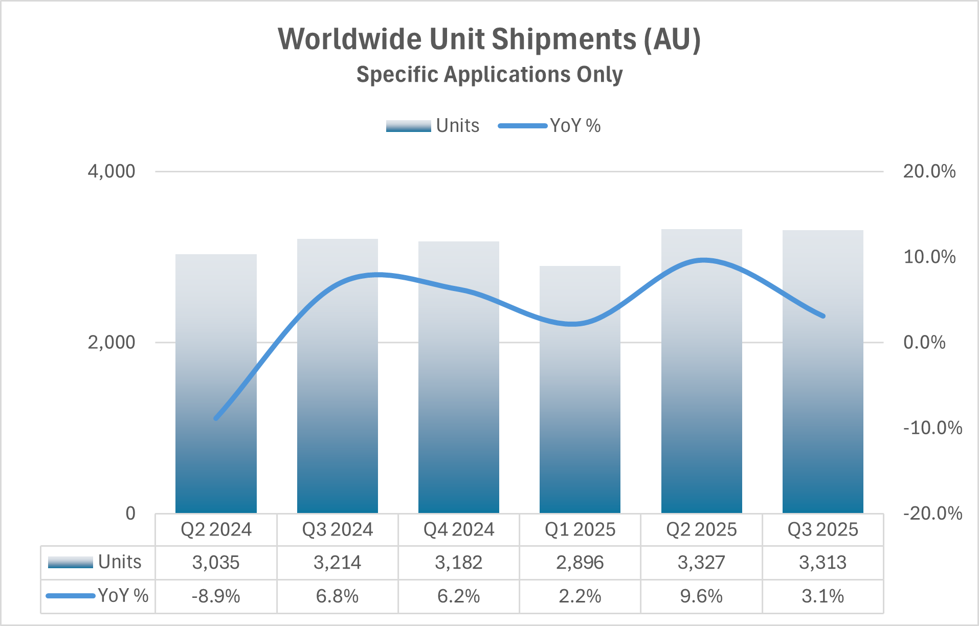
I’ve anonymized this chart to not offend the organization who published it, but this chart is based on a real industry report. Unfortunately, it’s not an uncommon choice and arises when anyone is challenged with presenting two pieces of (supposedly) related data on a single chart or slide. I have several issues with the chart:
- The bar chart is correctly scaled to a lower value of zero but the large values make it difficult to see year to year changes which only occur within the upper 15% of the range.
- The trend line has been “smoothed”. This obscures the data and implies movement between quarters that doesn’t exist.
- The quarterly results are from Q2 of one year to Q3 of the next—six quarters. This seems like an odd choice and I would argue starting at Q1 and continuing through the latest quarter (or quarter of interest).
- The year-over-year percent change implies past values are important, but the reader needs to back-out the prior year values if they want to make a direct comparison to the prior year. If we’re looking at changes over the past, in this case, three years, let’s show that data for each year.
To address these issues, I want to apply the following ideas to make the charts more accessible to the reader: don’t use two y-axes (make this a rule, not a guideline), trends should be captured with a line chart, the time frame of interest should be clearly stated in the title or subtitle (preferably the subtitle), the x-axis dates should be legible (the chart above does this well, but it’s often a challenge with time-series data), and finally, any chart created should stand on its own without needing a table—if a table is needed for reference, it should be a standalone item.
Can this data be presented on a single panel without two y-axes? Here are two ways.
Alternative A
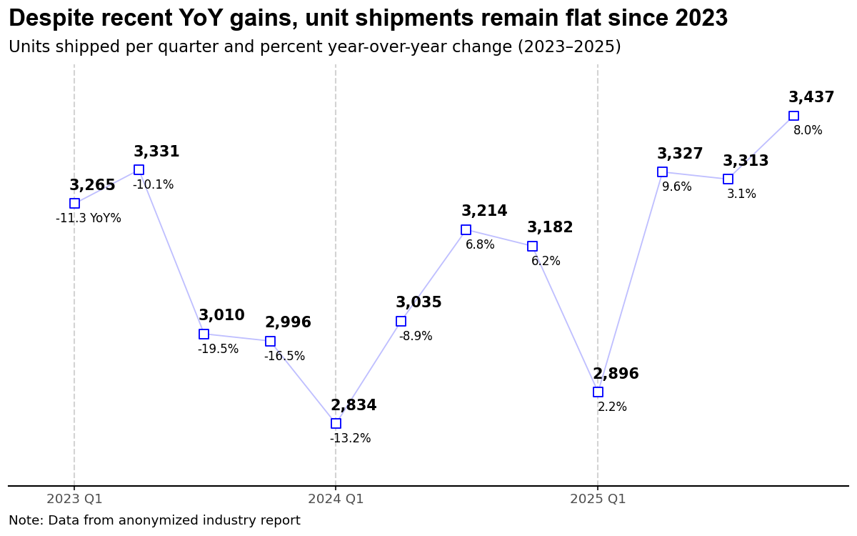
First, I decided that the period of interest is from 2023 to 2025 with the main message being captured in the title and the period clearly defined in the chart subtitle. Most importantly, I’ve changed the bar chart to a line chart as I want to focus on trends in the data; this immediately frees me to narrow the y-axis scale making the year-to-year variations visible. For this chart, I decided that I want the reader to have access to all the data, so each point is labeled with both the number of units (shipped) and the year-over-year percent change positioned above and below each marker, respectively. This chart pushes the upper limit of values placed on a chart—I see 10 to 12 labeled points being an upper limit. There’s a real argument that I’ve just moved the data table into the chart rather than eliminating it, but I’d rather have annotations the reader can immediately follow than a separate table they have to cross-reference. Units use a bold font to ensure a dominant position. Overall, I would argue this chart captures elements from the original while reducing the cognitive load required by the reader.
One thing I’d consider changing is my display of each period (quarters). While the major grid lines are sufficient for the calendar year, the minor grid lines are subtle and may not provide sufficient differentiation for some viewers. Adding a light shading to the panel with white grid lines would be an option worth exploring.
Alternative B
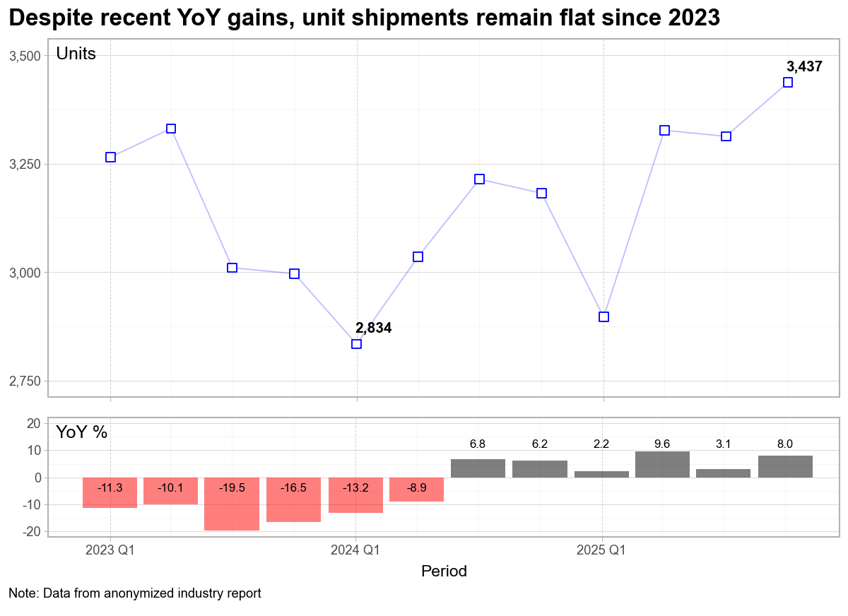
Since the dual y-axis chart is really two charts, it makes sense to create two charts. The question is then, how do I place these charts on the page to help the reader digest the content quickly. Not only do we have the obvious options of side-by-side versus stacked, but we also have to consider the relative size of each chart and how that conveys the message we want to deliver.
In the second example above, I’ve kept my basic line chart, but decided to only include the minimum and latest value in the chart. Because of this choice, I’ve reintroduced the y-axis which allows the reader to approximate the other values as needed. I could have used a second line chart for the year-over-year percent changes; however, the bar chart clearly differentiates the two sets of data. The ability to color negative values as red is a further visual cue that the period from 2023 to early 2024 was difficult, but that since Q3 2024, the trend has been positive.
I also made a choice to move the y-axis titles to a horizontal position at the top of the panel of each chart. No need for the reader to tilt their head as they scan down the page. I’m aware of at least one plot tool that implements this style as the default placement.
That said, the size of each panel is used to convey importance, with the top chart (Units) dominating the bottom chart (YoY%).
Again, to aid the reader, I’d like to find a way to incorporate quarterly labels to the chart; however, my fear is that additional labels would add visual clutter. The quarterly bars do an adequate job providing this differentiation. If my plan is to use this chart in a presentation, I’d take time to ensure the fonts are appropriate—they may need to be increased.
My Conclusion
The visual clutter and cognitive load associated with dual y-axis charts can be avoided by using annotations on a single chart, or by creating two separate charts. This can be a time-consuming task in Excel; however, modern data analytic packages in python (Plotnine) or R (ggplot2) enable a repeatable framework that can streamline the process.
There are some great books available to help you create impactful charts and presentations. Three resources I continually reference are: Storytelling with Data by Cole Nussbaumer Knaflic which provides a solid framework to build effective data visualizations; Strategic Storytelling by Dave McKinsey, an overlooked gem demonstrating how top consulting firms incorporate visualizations into effective presentations; and Slide:ology by Nancy Duarte, which pushes the reader to think like a designer. While each has their own terminology, the goal is always the same, create visualizations (presentations) that inform the reader or audience.

[…] Fixing a Dual Y-axis Chart from a Real Industry Report: Two Alternatives […]
LikeLike